
Leader
Summer 2022

 In the past, the mobile checkout process has been given a pretty bad rap.
Lacklustre conversion rates and high abandonment levels from smartphones and tablets (estimated at 84% from mobile phones as opposed to 68% from desktop by cloud.IQ in 2014) led to the finger of blame being pointed squarely at poorly-designed mobile websites, and the checkout process in particular.
However, with mobile “fast becoming the No. 1 online sales channel for UK retailers,” a stellar mobile checkout process is paramount.
Context is key when it comes to designing a great user experience, and it’s important for online retailers to consider that mobile users have a whole different set of requirements to their desktop-using contemporaries.
They’re probably on-the-go (and as a result are shopping with a certain product in mind), they’re likely to be prone to distraction by incoming phone calls, messages and notifications, they may not be connected to WiFi and so be at the mercy of their 3G connection and, importantly, they’re using a touch-screen device with a smaller screen and a fiddly keyboard.
As a result, it’s important to build a mobile experience that is tailored to these conditions. Here are eight things that you should ensure are built in to your mobile checkout process if you want to improve your mobile conversion rates.
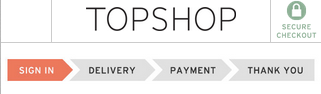
Let users know exactly where they’re at in the checkout process
A well-designed progress bar is a staple of any good ecommerce checkout. Checking out is perhaps the least exciting part of the purchasing process; progress bars let users know that the end is in sight, alleviating the worry of being caught up in a lengthy process.
This is even more pertinent in the case of mobile checkout, where the user might be out and about and in a hurry. An example of good mobile progress bar design is from Topshop, below.
Reduce the number of clicks on-the-go customers need to make to buy
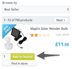 As mentioned above, mobile shoppers are less likely to be simply window shopping; they’ve often got a pressing requirement or are buying something that they’ve already checked out on a desktop site.
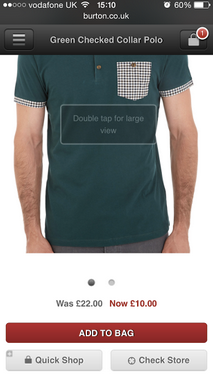 To cater to these guys, many online retailers are opting to let users add to basket from the search results page (like Maplin on the left), or giving them a ‘quick buy’ or ‘quick shop’ option on the product page that takes them straight to the checkout (like Burton on the right), reducing the number of clicks needed to buy.
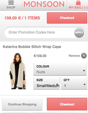 Another really nice function we’ve seen designed to reduce the number of clicks needed to purchase is on the Monsoon site, which lets users change the colour, quantity and size of product within the checkout area itself – meaning that users don’t have to go through the process of deleting items and navigating back to the product page to re-add them to basket if they change their mind.
Reassure wary mobile users that their details are safe with you
 This great little study from Webcredible highlighted security issues as one of the chief barriers to m-commerce adoption – with participants worried about the possibility of having their phones hacked or infected with viruses (the perceived exposure because of lack of antivirus software and connection to public networks driving this).
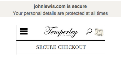
A good way of counteracting this is by visually reinforcing the secure nature of your checkout process (providing it is actually secure, of course!). Some great examples above from John Lewis and Temperley London (who display a security band on each page in their checkout).
Make it as easy for customers to enter the checkout area and buy the product
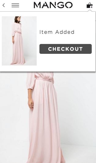
Some retailers (like Mango on the left) launch a popup once an item has been added to a shopping bag with a link straight to the checkout area – granting them an easy way of reaching the checkout quickly, but also allowing them to carry on shopping if they wish.
Reduce the form-filling friction as much as possible
Forms are perhaps the biggest liability in the mobile checkout process, with the potential to infuriate customers to the point of them giving up. Best practices for mobile forms include:
Top-aligning form labels
This enables the field itself to stretch the full width of the screen (vitally important on mobile, where side-scrolling to check for errors in incredibly difficult).
Disabling auto-correct on certain fields
Surnames, road names and place names are all prime fodder for an auto-correct disaster. This article in Smashing Magazine makes the great recommendation for turning off auto-complete by adapting input tag:
<input type=”text” autocorrect=”off” />
Only asking for need-to-know information
Typing on mobile is a giant pain in the proverbial – don’t ask your visitors to do more typing than is strictly necessary.
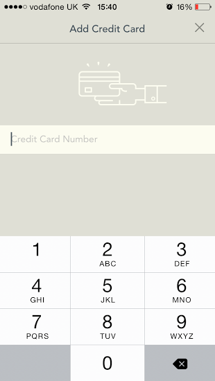
Making sure your keyboards are field-sensitive
A great example of this is from YPlan below, which brings up a really nice screen for entering your card details in which the keyboard is automatically numerical.
Reduce the risk of visitors having to enter information twice
As mentioned above, and in our post on form usability, nobody likes filling out forms. And one of the most rage-inducing aspects of form filling on mobile is clumsily punching in all of your data (including your fiddly postal and email addresses – eurgh) only to be served an error message and made to fill the whole sorry lot in again.
The main way to prevent this happening in the mobile setting is by temporarily storing inputted data using localStorage, however, other ways of combating data loss include:
– loading any pages that are linked from the checkout area (such as help pages, delivery instructions etc.) in a new window
– display a pop up message if a user goes to leave the page asking to confirm the action
Give users the opportunity to check out without creating an account
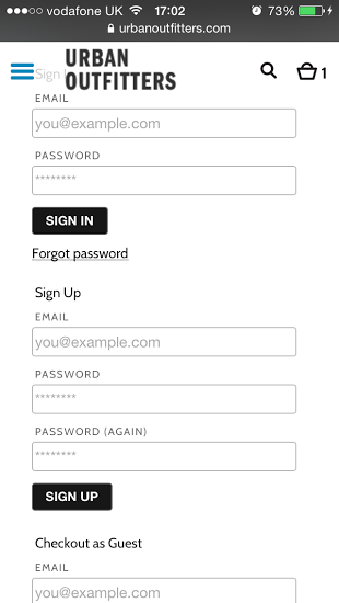
The sign-in page is a really tricky one to get right, and can often be the source of confusion (for more on this read point #6 in this article). Being able to sign into an existing account is an important feature, as a user’s contact and payment details are likely already stored so they won’t have to re-enter them. Likewise, giving customers the option to create an account should also be considered. Offering a guest or ‘express’ checkout option is also important for those in a rush.
Urban Outfitters does a nice job of this, with a ‘sign in’ option, a ‘sign up’ option, and a ‘checkout as guest’ option for those who don’t want to faff about creating passwords and confirming accounts.
Don’t make users fill in their address twice
Filling out addresses on mobile is a particularly torturous, time-consuming activity. Two ways of significantly reducing the time and stress associated with entering an address is to a) use a postcode lookup tool that auto-fills the address fields b) to allow users to tick a box that allows them to use the same delivery address as their billing address. Thank goodness for that.
Ometria is committed to protecting and respecting your privacy, and we’ll only use your personal information to administer your account and to provide the products and services you requested from us. You may unsubscribe from these communications at any time. For information on how to unsubscribe, as well as our privacy practices and commitment to protecting your privacy, please review our Privacy Policy.


Take the first step toward smarter customer marketing