 In the ecommerce marketing realm, micro-copy is sacred.
We’re talking about any short bits of copy found on a brand’s website that help online shoppers:
Some of the most obvious places your brand will need effective micro-copy include: headlines, sub headings, calls-to-action (CTAs), pop-ups, product descriptions, navigation bars … the list goes on.
But how do you go about creating it?
This question is not a new one; for centuries writers (especially newspaper journalists) have agonised over the best way to use as little copy as possible to convey the most information.
However, it’s not necessarily older, experienced brands we should turn to for inspiration with this, but younger, smaller online retailers—born into the world of ecommerce and adept at communicating with customers in just a couple of dozen characters via social media.
This doesn’t mean your brand’s writing style should resemble your niece’s Snapchat captions, but the millennial approach—of paring back as many words as possible until you’re left with something that a) communicates your point and b) captures a certain ‘voice’ —is worth investigating.
To get you started, here are four contemporary ecommerce brands mastering the art of micro-copy.
“Created in 2009 by Yael Aflalo, we design and manufacture the majority of our limited-edition collections in our factory headquarters in downtown Los Angeles.”
Reformation uses great micro-copy in its:
Anyone who Googles “Reformation brand” will be met with the following results:
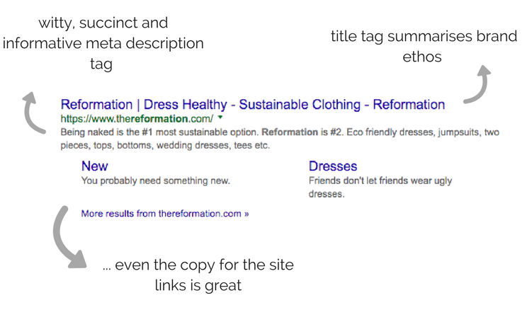
Through just four words: “dress healthy, sustainable clothing”, the title tag immediately gives an online shopper a taste for what Reformation stands for, and an idea of what to expect upon entering the site.
An attention-grabbing statement is included in the meta description tag: “Being naked is the #1 most sustainable option. Reformation is #2”, and even the copy for the site’s main links is marvellous (“You probably need something new” and “Friends don’t let friends wear ugly dresses”).
A retailer’s homepage is a prime opportunity to make a strong first impression and communicate to new visitors what it’ all about.
As shown in the example below, Reformation pulls this off by splitting its core elements into three boxes. And to keep a reader super-engaged, it uses short, fun captions for each.
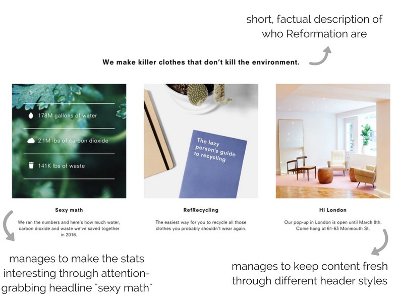
The obvious favourite here is “sexy math”. This is an oxymoron for anyone who loathed maths at school, but it works—grabbing a reader’s attention before they can zone out.
The newsletter signup box is one of the most important aspects of an ecommerce site, as it’s where potential customers will decide whether or not to give you their details for future marketing messages.
In other words, this signup box needs copy that’s spot on.
Again, this doesn’t mean embellishing the copy you already have, adding in redundant adjectives and flowery CTAs. It means really thinking about alternative ways you can use words to inspire a visitor to subscribe.
Reformation achieves this by positioning its newsletter signup box as an opportunity for website visitors to “join” something new.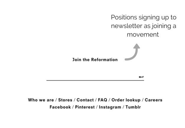
This word, “join”, creates a sense of union and togetherness; subsequently bringing together everyone who signs up to the brand to form a “reformation”.
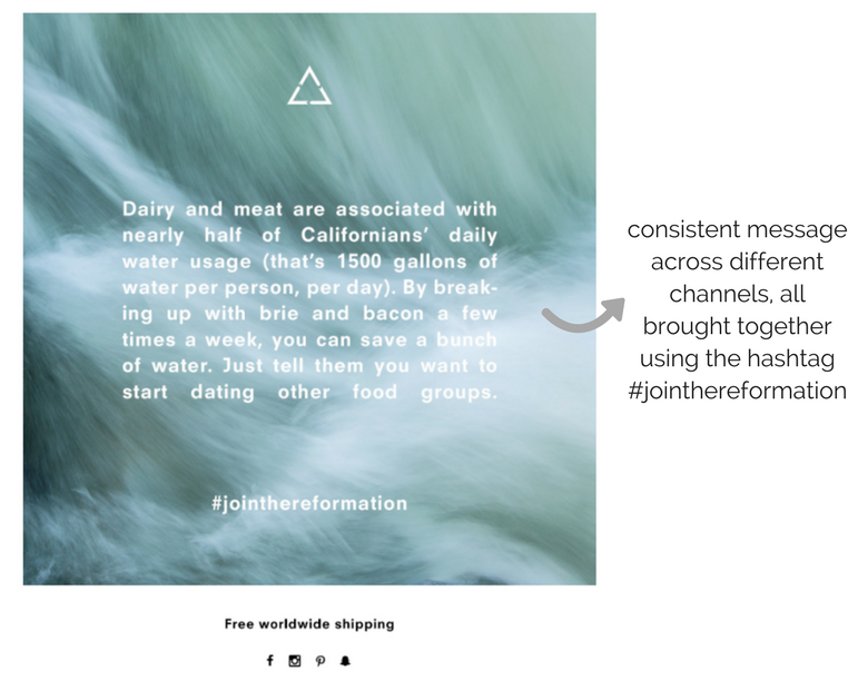
At the bottom of its newsletters, Reformation includes different interesting facts relating to the environment, thus strengthening its “dress healthy” mantra.
All of these messages are brought together using a hashtag repeating the above CTA: #jointhereformation.
This consistency reflects a solid brand identity and helps to build the Reformation movement’s credibility.
Aside from creating a progressive, fashion-forward and environmentally friendly movement, Reformation also utilises micro-copy to create a friendly and laid-back tone throughout the customer journey.
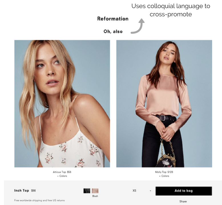
For example, once an online shopper has checked out a certain product, they are recommended similar items under the simple and informal headline “Oh, also”.
These two words are pretty generic, but they work so well because they emulate what an actual shop assistant might say whilst helping you find something in a physical store.
Rad uses great micro-copy in its:
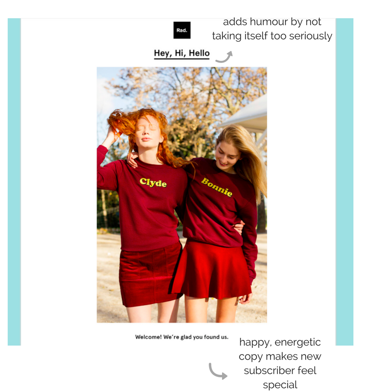
Rad gives new subscribers a warm welcome by greeting them in three different ways: “Hey, Hi, Hello”. Clearly pretty comical, this automatically says “here is a brand that likes to have fun”. This is reinforced by the image, depicting two girls smiling and wearing matching outfits.
As mentioned in the introduction, micro-copy isn’t just about creating personality and a good brand voice, it’s also about genuinely helping visitors navigate your site.
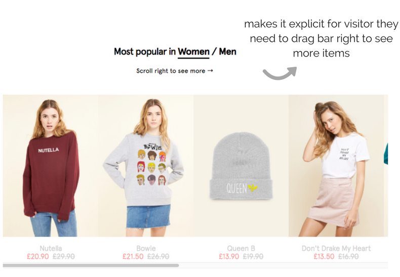
In the example below, Rad ensures a visitor is aware they can view more popular items by dragging the grey bar to the right through the explicit copy: “Scroll right to see more”.
“Founded in 2014 by a gang of babes who believe good design belongs to everyone, for everyday life, AYR stands for All Year Round.”
AYR uses great micro-copy in its:
AYR is a brand that proves micro-copy doesn’t have to be really clever or quirky to work; sometimes the most simple phrase, joke or word is all you need to create an impact.
This pop-up, asking website visitors to sign-up to AYR’s newsletter, would be distinctly average if it wasn’t for five tiny (albeit visible) words: “We write good emails, too.”
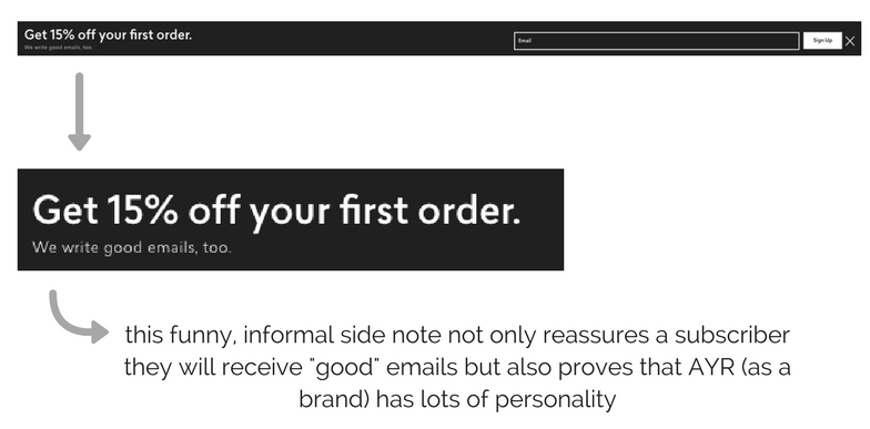
This mico-copy works because it reads people’s minds and delivers accordingly; what would prevent a visitor signing up to a newsletter? Bad emails. So the copy confirms the emails won’t be bad.
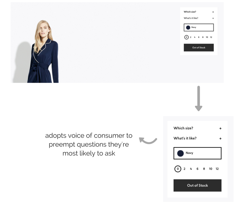
Likewise, if you’re about to buy a dress online, what exactly will you want to know before heading to the checkout? Firstly, whether the sizes available are going to be right for you, and secondly how easy the dress will be to take care of.
As shown in the product page screen grab below, AYR combats both of these questions head on—adopting the voice of the visitor with the two questions: “Which size?” and “What’s it like?”.
Once a visitor clicks on the “what’s it like?” question, they are met with the following landing page:
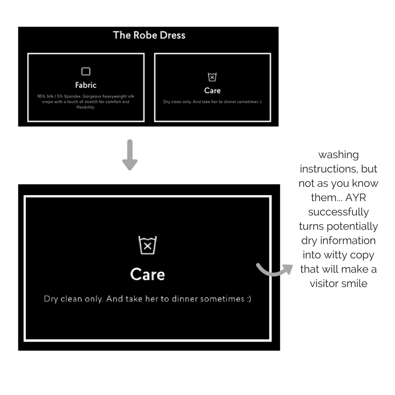 As well as letting a shopper know how they need to look after their new purchase, AYR also adds a splash of humour via the line “And take her to dinner sometimes :)” to ensure the copy doesn’t get too dry.
(Also, the smiley face just proves it’s okay to have fun with your ecommerce site visitors, and break traditional copywriting rules now and again .)
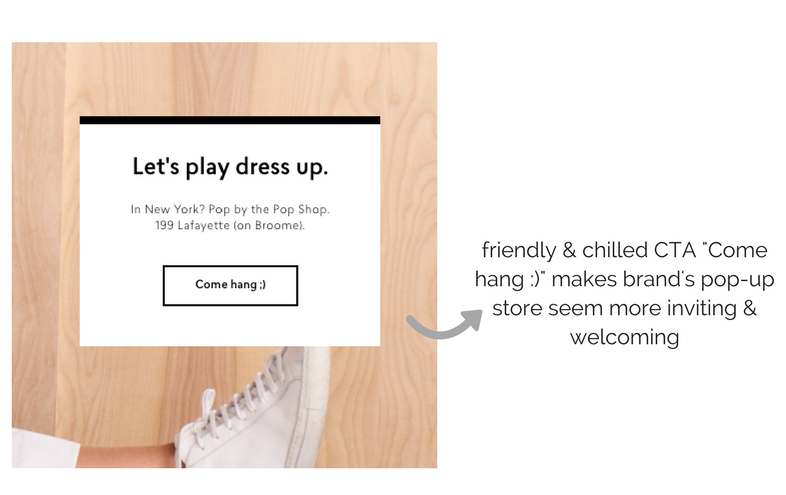
Across their digital marketing, AYR also nail the wording of their CTAs. Below is a classic example of the brand turning a standard promotion for its pop-store into a friendly, fun invitation to try on clothes and “hang” out.
Idoni uses great micro-copy in its:
The examples used above adopt a voice that is perhaps more attractive to women in their late teens, twenties and thirties, but good micro-copy can also be used in a way that appeals to shoppers across all ages.
One brand proving this is Idoni.
As the new kid on the (ecommerce) block, Idoni uses its homepage copy to introduce newbies to the brand—delving straight into who they are and what they’re all about.
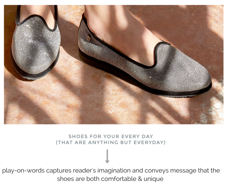
Alongside a beautifully shot image of the shoes they sell, the simple but powerful copy “shoes for your every day (that are anything but everyday)” manages to sum up the fact that these shoes are practical and comfy, but also stylish and special.
This micro-copy also links nicely to the brand’s overarching ethos, which is: “the fundamental belief that when it comes to shoes, women shouldn’t have to sacrifice comfort for style or vice versa.” Moreover, the word “idoni” comes from the Latin “idoneus”, which means “fit, suitable”.
For those who stick around on the site, Idoni quickly moves on to what sets them apart from competitors.
As shown below, this is done nicely through more clever use of language (in conjunction with quirky icons):
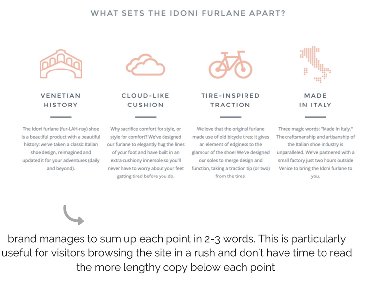
Like news reporters, marketers need to strip everything back to bare bones when writing headlines. Idoni do this perfectly, managing to sum up what they want to say in two or three words per heading.
As touched upon earlier on in this post, micro-copy is also understood as something marketers can use to help website visitors follow instructions/ understand which forms to fill out.
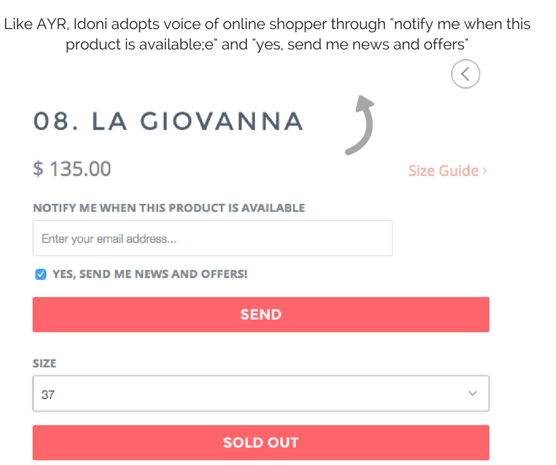
For example, for its in-stock notification system, Idoni uses the written word to help a shopper know exactly what they need to do: “Enter (their) email address”.
The brand also adopts the voice of the shopper to confirm what it is they are singing up for; as shown in “notify me when this product is available” and “yes send me news and offers”.
We know this is a lot to take in, and different brands will use micro-copy in different ways depending on their personality, ethos and demographic.
However, here are the top things to remember when creating kick-ass micro-copy for the modern reader:
Ometria is committed to protecting and respecting your privacy, and we’ll only use your personal information to administer your account and to provide the products and services you requested from us. You may unsubscribe from these communications at any time. For information on how to unsubscribe, as well as our privacy practices and commitment to protecting your privacy, please review our Privacy Policy.
Take the first step toward smarter customer marketing