


Leader
Summer 2022

.png "ecommerce website header")
Website headers. Sure, they might not be the most glam part of ecommerce store design, but they’re arguably one of the most valuable pieces of on-site real estate going.
Why? They’re often one of the first things a visitor sees when they land on your site, and play an important role in making a killer first impression for newbies to your brand, as well as performing a navigational function that’s crucial to moving browsers on through the journey to purchase.
So yeah, pretty important.
This blog post will walk you through several key elements of ecommerce header design:
Primary category/product navigation
Secondary navigational elements
Search
Offers and promotions
We’ll go over some best practice tips and also offer some real-life website header inspo from a handful of top online retailers that have really nailed it with header design. And remember: testing is everything, so be sure to experiment with these elements to see which leads to the most conversions.
Optimising navigation can be a big winner when it comes to maximising revenue generated by your store. And the way in which navigation options are conveyed in your main header is all-important, especially to casual browsers who have turned up with only a vague idea of what they’re after.
Some visitors will arrive at your site knowing very little about who you are or what your proposition is. And if they don’t feel like you’ve got what they want, they’re likely to bounce, pronto.
The main navigation bar on your site is the perfect opportunity to showcase the breadth of your product offering without forcing visitors to delve into the depths of your site.
For example, if you’re a menswear retailer, you might want to include different departments (‘new in’, clothing, shoes, accessories, etc.). If you sell both mens and womenswear, ensure that categories within each department are easily reachable (like the example from Zara below).

{{cta(‘306064aa-50d7-4a14-a6dc-9b4edbcf9efa’)}}
An extension of the point above, getting your dropdowns right is also really important for helping visitors explore and get where they want in minimal clicks.
Many online retailers now opt for ‘mega menus’ – perhaps not quite as exciting as the name suggests, they’re a single dropdown that shows a large number of options in one panel, grouping them into categories and subcategories. It’s less complicated than it sounds – two great examples are John Lewis and Topshop (see both below), who enable visitors to search by category, but also by collection, fit, brand etc. Super userful.
Bonus tip: don’t be afraid of including a subcategory in more than one parent category if it’s logical to do so (for example, putting a ‘desks’ category in both the ‘tables’ and ‘office’ parent categories of your dropdown).

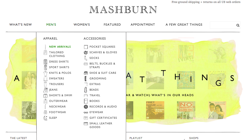
Adding a visual element to dropdowns is another nice touch. MAC (below) is a great example of this, with its super slick sidebar approach, in which each product and category has an image that helps guide the visitor. Likewise, Mashburn incorporates icons into its dropdowns to guide visitors to the right page.
Content – whether in the form of lookbooks, online publications, blogs etc. – is becoming an important part of an ecommerce marketer’s arsenal, and promoting it effectively is half the battle won.
Don’t forget to use your navigation menu to promote content that you’re creating (making sure that the content in question does a good job of selling your products rather than distracting would-be buyers). Benefit, below, saves a section of its dropdowns (‘Beauty Banter’) to promote its content.

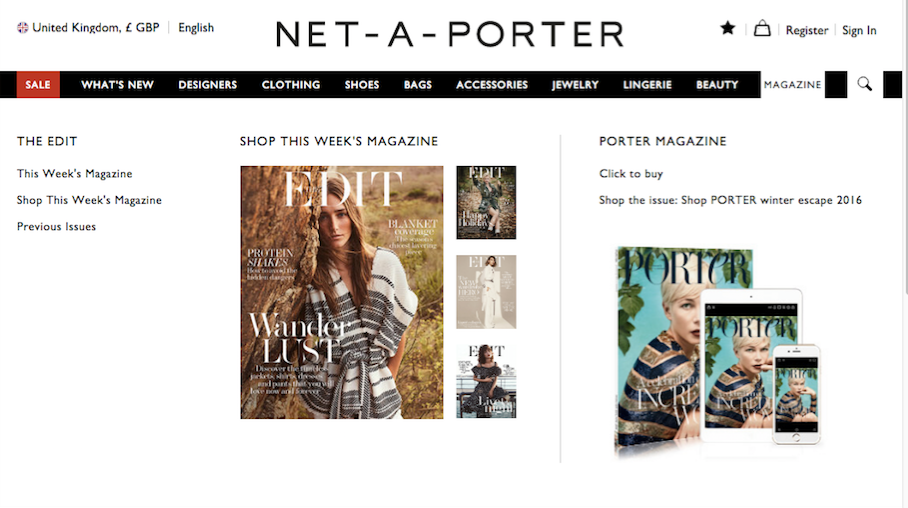
Likewise, Net-A-Porter reserves a part of its main navigation bar for ‘magazines’ – which triggers a dropdown featuring Porter magazine and The Edit.
 Further reading
An E-Commerce Study: Guidelines For Better Navigation And Categories
Optimizing e-Commerce Site Navigation – Part II: Primary Navigation
So we’ve established that helping visitors along the path to purchase with a well-thought-out navigation bar is one important aspect of ecommerce header design. But there are a number of other navigational functions an ecommerce header can – and indeed should – incorporate.
When you’re trying to secure that all-important purchase, the last thing you want hampering your efforts is a visitor not being able to find their shopping basket (hopefully full of your products) easily.
Many online retailers (like New Look, below) choose to link to basket (and even wishlist) direct from their website header.
For multi-channel retailers, having a quick link to a store finder can be great, especially for anyone who is out and about and trying to track down your closest store. Schuh positions this link right about its logo in the top right hand corner of the page.
While some choose to position newsletter signup boxes in the footer of their homepages, many online retailers keep theirs prominent, above the fold in the header like Lazy Oaf below. Likewise, being able quickly sign in to an account should also be incorporated into the header.

The features that we’ve covered so far have been, on the whole, geared towards casual browsers; those who perhaps do not have a solid idea of what they want to buy. But what of potential customers who do? This is where the search bar comes in!
It’s often said that people who use search tend to have a higher than average likelihood of converting, so it’s important to make your search box easily findable. Don’t make me search for search, bro.
Nonetheless, don’t be fooled into thinking that encouraging all users to use search will result in higher conversion rates across the board – this is classic case of ‘post hoc ergo propter hoc‘.
The placement and design of your search bar are prime candidates for testing – be sure to experiment to see how adjustments affect your conversion rates.
So first things first: where should your search bar be positioned in your header? The answer to this question very much depends on how important search is as a method of browsing your site.
If search is the primary navigation method for the site, position the search-box centrally on the page, like House of Fraser below. If it is secondary (as it is on most ecommerce sites, where typically 5% of visitors use search), place it top-right on the page header, like Abercrombie and Fitch.
Pull & Bear also provides really nice example of slick search bar design.

Running with the ‘not having to search for search’ theme, the most important thing about the search box design is it visual salience – that the search box it prominent on the page.
This is achieved by size (make it noticeably big), visual isolation (white-space around it) and a high-contrast call-to-action button (typically labelled ‘search’). Some online retailers are even going with a simple magnifying glass these days – which research suggests is now universally recognised as representing search. Below are some nice examples from ASOS and Adidas.
Further reading
Last but not least, many retailers use their website headers to draw attention to particular promotions or special campaigns and ranges. Below are some nice examples from Argos, Claire’s and ASOS.
Ecommerce website headers perform a really important role, both in terms of navigation and making a great first impression.
There are a number of elements worth thinking about with ecommerce header design:
Primary category and product navigation
Secondary navigation
Search
Offers/promotions
Testing is incredibly important – ensure that you’re experimenting with the impact that tweaking these elements has on conversions
Primary navigation – Ensure that:
Your header reflects product breadth
Your dropdowns are logical and help guide visitors using parent and sub-categories
You try out promoting content within the primary navigation
Secondary navigation – Ensure that:
Your header links to key elements in the purchase journey like your shopping basket, account sign in or a store finder
You consider including a newsletter sign up box in your header
Search – ensure that:
You test the position and prominence of your search box to see if this impacts conversions
You test the design of your search box, making sure that it is easy to find and contrasts with its surroundings.
Offers and promotions – test out whether including any promos that are running in your header encourages people to take you up on offer.
{{cta(‘9d574c3e-b22c-4692-b853-1eccd56b2113’)}}
Ometria is committed to protecting and respecting your privacy, and we’ll only use your personal information to administer your account and to provide the products and services you requested from us. You may unsubscribe from these communications at any time. For information on how to unsubscribe, as well as our privacy practices and commitment to protecting your privacy, please review our Privacy Policy.


Take the first step toward smarter customer marketing